Brands should be doing all they can to direct mobile users to the checkout as quickly as possible in order to encourage window shoppers to actually make a purchase.
Making it into a one-click process, similar to Amazon, will also help capture impulse buyers.
So, here a few basic rules for how brands should design the checkout buttons and calls-to-action on their mobiles sites to simplify the process and help drive up those conversions...
Make it colourful
Calls-to-action (CTAs) should use a colour that ensures it doesn’t blend in or match with other buttons. Orange is sometimes recommended as the ideal colour as it draws attention to a button without being too bright.
Some colours have other connotations; some may associate red with danger or debt, while green can signify ‘go’. These are all things to consider when choosing a colour.
Different variations should also be tested until the best performing colour and button combination is found.
Marks & Spencer’s buttons are quite lifeless, though they do fit in with the overall colour scheme, and it’s surprisingly easy to miss Topshop’s black CTA.


In contrast, Amazon’s yellow buttons stand out against the blue and white background colours, and it then immediately gives you the option of going to the checkout.
This is a great way of capturing sales as it shortens the purchase journey and means the user doesn’t have to work too hard.


Use unambiguous wording
The wording you use should make it glaringly obvious what will happen if a user presses a button, such as ‘Add to basket’ or ‘Checkout.’
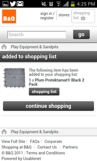
B&Q must be the only brand in the UK that uses ‘Add to shopping list’ instead of ‘shopping cart’ or ‘shopping bag’. This could be confusing for shoppers.
The once you’ve added it to the list, how do you get to the checkout?

Make them massive!
CTAs should be the biggest link on the page, so make them noticeable. Big buttons won’t entice everyone to make a purchase, but it reduces the frustration and abandonment rates for serious shoppers and might grab some impulse buyers.
Walmart is a great example of this. It uses huge yellow buttons placed immediately underneath each product, making them impossible to miss.
Then once you've selected a product it leaves you in no doubt about where you should be headed...


Put them where they can be seen
Buttons should be placed where users’ eyes are likely to scan as they view the product page. Ideally you don’t want users to have to scroll too far, if at all.
Many brands put them at the bottom of the page underneath a huge amount of product and delivery information, but Walmart’s strategy of making the CTA the first thing that users see under the product image creates a greater impact on mobile.
Create a sense of urgency
Creating a sense of urgency can help convince users to make a purchase there and then.
Why use ‘Add to basket’ when ‘Buy’ is snappier and takes up less space? Obviously it doesn’t work in all cases, but brands need to be willing to test different tactics and wordings to try and increase mobile conversions.
ASOS creates urgency by saying ‘Pay now’ rather than ‘Checkout’, although the buttons should be much larger. Similarly, Asda has ‘Buy now’, but might consider using a different colour to make the CTA stand out from its usual branding.


Get them to the checkout ASAP
Once a customer has selected a product do you want to encourage them to keep shopping, or just direct them straight to the checkout?
It probably depends on the type of industry – grocery shoppers might be buying several items so it makes sense to give them further product options.
But when people are browsing fashion items it might be better to get them to the checkout straight away so you don’t miss out on impulse buys.
Clothing retailer Next uses big buttons that standout against the background, but once you have added an item to the basket you are encouraged to continue shopping rather than being ushered to the checkout.

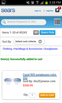
Sear’s mobile site is even worse. Once a user has added an item to their basket there is nothing to direct them to the checkout other than a tiny symbol in the top left of the screen.
Click-to-call
Another way of making the checkout process easier for customers is to give them a telephone number to call in case they get stuck, have further questions, or would like to complete the purchase or reservation by phone.
Giving them the option of clicking one button to speak to a call centre may capture extra conversions from customers who would otherwise abandon the purchase.
In general the retailers sites I looked at didn’t display telephone numbers on any pages during the purchase journey. Instead you have to go to a separate page that lists all the company's contact details.
Those that do show contact numbers, such as John Lewis and Next, do it in a subtle way that could easily be overlooked.

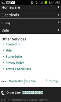
This may be a conscious decision as companies want to encourage customers to purchase online rather than increasing enquiries to their call centres, but it is still a useful option for mobile shoppers.
Other industries tend to be more forthcoming with their contact details. For example, Bupa’s insurance site and London restaurant Volupte both feature prominent CTAs that link directly to telephone numbers.


Adapt for different devices
CTAs should be tested to make sure they render correctly on different mobile devices, and brands should also consider the different creative options available on each device.
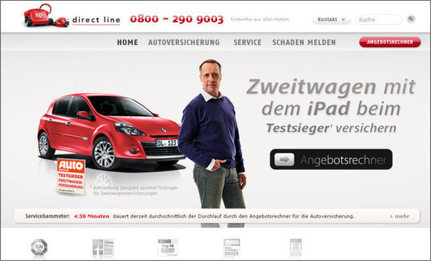
For example, Direct Line used a swipe button for the iPad-friendly version of its German homepage.
It's an action that iPhone and iPad users are very familiar with, and this led to a 9.23% increase in registrations for a quote:



Share the News