


First of all, we suggest that you run a mobile optimization test to determine the current state of your site.
If your site is mobile-friendly, you should also check for compliance with other Google algorithms and guidelines.
For website owners whose website has not passed the customization test for mobile, we'll provide useful tips on how to adapt to the new Google rules in this field.
WHAT IS A MOBILE WEBSITE?
A website optimized for mobile is essentially any site that is well displayed and easily used on mobile devices. As an increasing number of people use mobile phones, adapting to this purpose will not only give you good results in the search but will also increase the satisfaction of your visitors (customers) and ultimately lead to more sales.
These are some of the key things you need to know to customize the site for mobile audiences and algorithms:
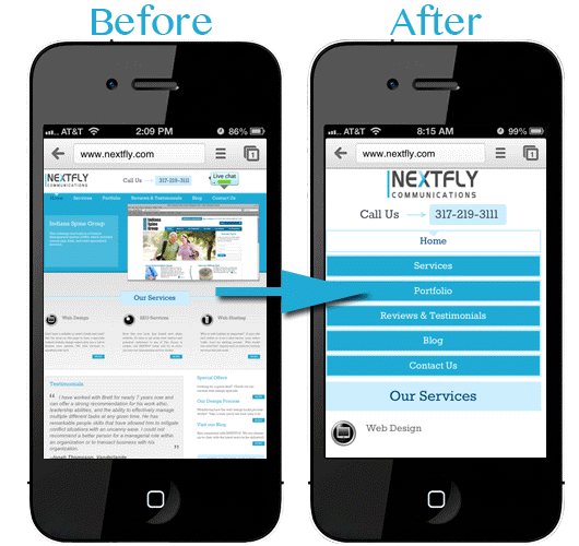
• Ensure that the site is easy for visitors: this is the basic principle that you need to respect. Design your site to make it easier for visitors to achieve their goals. Mobile users require simplicity and solution in as little clicks as possible. The effectiveness of your site will be reflected in how easily users will fulfill general tasks.
• Ensure that the text is legible enough: the fact is that the screens of the mobile devices are much smaller than the computer screens, so make sure that the text size is adequate. Zooming can confuse users and make them difficult to read.
• Space between links: Be aware that users with thick fingers have problems choosing links that are close to each other, such as menus or links within the text. We advise you to make a little more space between the links.

• The content should not be wider than the screen of the device: If you have a display that is expanding relative to the target mobile screen and requires users to scroll left and right, this is not a good mobile experience. From the designer's point of view, the design of the website should be made based on the content, not the other way around.
• Maintain the visual consistency of the site on all devices: the easiest way to do this is to use a responsive web design that implies that users can access the same URL from the desktop, tablet, or mobile phone, and the display is adjusted depending on the screen size.
TO USE THE RESPONSIVE DESIGN OR CREATE A SPECIAL MOBILE VERSION?
Google recommends using responsive web designs in relation to other design models. One of the main advantages of this approach is that you need to maintain one version of the site instead of two (for example, you will not need to maintain two sites at www.example.com and m.example.com but only one that is adapted for all devices ).
By maintaining only one version, all marketing efforts will be directed to just one address and this will contribute to better online results for your business.

HOW TO ADJUST THE MOBILE SITE?
In order to customize your site for mobile, you need to have a good knowledge of HTML, CSS, and basic settings for responsive web design.
Depending on the type of project, you can choose to write a full code from the beginning or to speed up the process using one of the popular responsive framework solutions (Bootstrap, Foundation, etc.). In some situations, you will need a ready-made HTML template with a predefined design.
If none of these options are appropriate, we suggest that you engage a professional web design agency that will make a complete solution tailored to the needs of your business.
Follow me on Twitter - @SrdjanKali.
Share the News