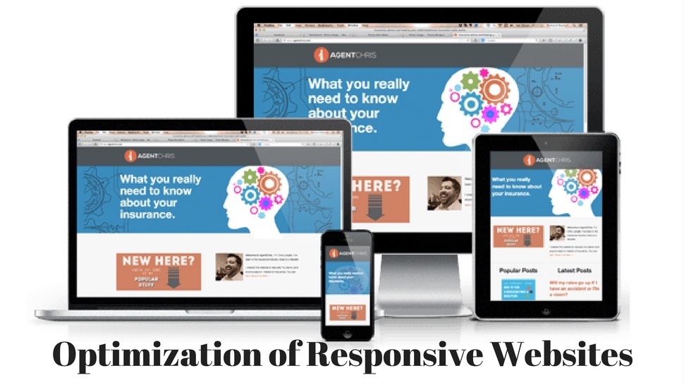
Responsive web design has been popular among web designers for several years now, although it has become popular since 2013 from a rally, making it easier to design a responsive site that will be proportionally displayed on all devices, rather than designing different sites for each device.
The only fault is his speed. Without optimization, the responsive site will appear everywhere as a full desktop site, so if optimization is not done well, it will significantly extend the page load time on mobile devices.
There are several things that we can do to prevent something like that.

THE PICTURES SHOULD BE CORRECTLY OPTIMIZED
We all know that images are usually a problem of slow loading of pages of responsive sites. The quickest way to troubleshoot this problem is to use Adaptive Images because it detects the dimensions of the screen and the site decreases proportionately to the dimensions of the monitor, although we do not change <scr> and <img> tags.
MEDIA QUERIES
There are many good frameworks that can be found online, which eliminate the need for media queries such as Bootstrap, but that does not mean that they can be ignored. A media query in a responsive design is a CSS declaration used to invoke other declarations based on the screen size.
It can be used in two ways: as an external code or as a direct connection.

REDUCING HTTP REQUIREMENTS
As mentioned earlier, all HTTP requests are sent to each device, unless we tell them not to do it. To reduce these loading times JavaScript and CSS sources such as Compass are used.
It is an open source CSS framework that allows developers to create a clean markup and create sprites and extensions simply and easily.
For JavaScript, tools such as UglifyJS are priceless because they compress code, allowing automated JavaScript work.
CONDITIONAL LOADING
This is ideal to ensure that mobile devices and tablets do not download all types of content, such as maps, images...
This applies in particular to third-party scripts such as Gravatar and social media icons, as they will generally be directed towards larger devices.
Is it really necessary to burden a site with loading social network buttons? It depends on your needs. If you rely on SEO signals from social networks, then a simple sharing URL is not enough for you. Usually, the sharing of URLs is quite different from the likes, or G +.
However, there is always your main site for that, and plain URLs can be included in the style set for mobile and tablet devices.

TESTING
Whatever technique and source we use, the most important thing in creating a responsive site should be testing. Sources such as Screenfly can be used, but it is best to test it on the right devices.
The thing that you need to pay attention to is the utility, so you need to focus not only on the look but also on the functionality.
Pay attention to the text, whether it is displayed correctly. The tool that solves the problem of the text is FitText, which is the Jquery plugin for automatically updating the font size. Allows CSS font size to be ignored and used only for headlines.
Responsive design is an innovation and is recommended when creating websites. Even Google recommends it as the best way to design mobile sites.
It all comes down to functionality, so the design of the website should start, from a mobile application or a mobile phone site.
Minimalistic design is an instant trend, along with responsive design and these two things look perfect together.
Follow me on Twitter - @SrdjanKali.


Share the News