


We have collected the most notorious typographical crimes and ways to avoid them.
Whether you are designing a print or web, it is essential to guess typography. Poor font or background selection can prevent you from conveying a message that you or your client intended to send. On that occasion, we collected the most common typographical errors, ways to avoid them, and the opportunity to read more about this topic.
1. I AM YOUR SPACE AND YOU WILL NOT USE THE AUTOMATIC SETTINGS FOR ME
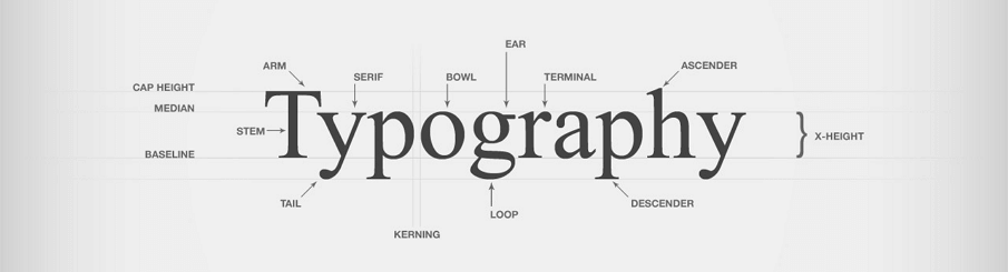
It happens too often: an excellent design ruined by a bad spacing between letters (white, kerning). When placing any title in programs like InDesign, Adobe Illustrator or even Photoshop, never trust the evaluation of the software that will recommend the automatic adjustment.
Take the time to pay attention to the space between the letters (kerning) and the space between words. InDesign offers you a lot of control over these two options.
To start these settings, click Preferences> Units & Increments> Keyboard Increments> Kerning / Tracking and set the desired size. This allows you to use the Alt / Opt and left / right buttons on the keyboard to fine-tune the font spacing. For more details about these settings, see the CreativeBloq blog about tricks for spacing adjustment.
2. DO NOT OVERDO IT WITH HANDWRITTEN FONTS
A handwritten font will not automatically make your article sophisticated - think carefully before using it.
Just remember how many times you've seen posters of New Year's Eve celebrations in a neighborhood tavern or flyers for tailor-made services in a handwritten font. Some things just need to be left, it's not worth it, believe me on the word.
3. NOT MAKE COLORFUL BACKGROUNDS AND DON'T PUT FONTS OVER THEM
One of the most irritating things on the internet is probably when the text cannot be read because the background is overly overwhelming. Yes, it is nice to choose a fantastic background photo, but do not hunt the space where you will put the text - think twice before doing something like that.
You may need to set your font in blocks in one color to highlight it, or even cut a picture differently and place the text somewhere else. The legibility should still be a priority. You may be able to read the text - as you know the text in question - but keep in mind that your readers may not be able to.
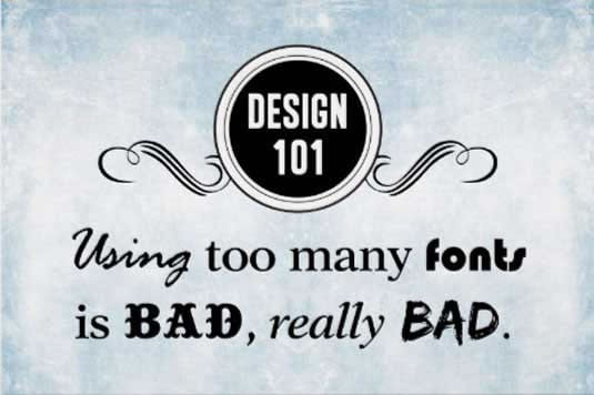
4. DO NOT USE TOO MANY FONTS
This is actually a mortal typography sin - exaggerating font selection.
Accessing thousands and thousands of fonts is great - but that does not mean that you need to use them all at the same time. Thanks to sites like Font Squirrel, there's no need for it.
Extracting this kind on your site, magazine, or any type of design can confuse and divert from the message. One general rule is that you do not use more than 3 fonts.
5. DO NOT MANIPULATE WITH LETTERS
Manipulating with capital letters (capitalization) never looks good - in fact, it's pretty ugly. If you want to add a bit of variety to titles using fonts, simply select a font that has this option. Fonts of this type can be found on Font Squirrel.
6. DO NOT MANIPULATE WITH ITALIC EITHER
While it's incredibly rare to find a font that does not have italics if you use just that, do not try to make it yourself - it just does not look good. At all. The most serious. It really will not.
Delete the small Skew icon in InDesign from your mind - that's the best one. If you want to learn more about this topic, you can read this, frankly, quite useful text about the fake and real italics of Mark Simonson, typography designer.
7. DO NOT WRITE ALL IN CAPITAL LETTERS
Although the capital letters look much more dangerous, and even more cool in the basic text, however, the use of capital letters in this way turns the basic text into an illegible mess.
Why? People do not actually read the word letter by letter, but ideogram - according to the form that the word says. The typography article on the Fonts website says that the form that the word occupies creates on the basis of the position and frequency of the ascender and descended, therefore, when something is written exclusively in capital letters, it becomes illegible.
8. DO NOT REVERSE COLOR OF THE BACKGROUND OR FONT
Choose the correct answer. What is the function of the white letters on the black background?
1)
2)
3) to make the text unreadable.

This useful guide to the site UXmovement mentions forcing users to fix it on white text for a long time can lead to eye fatigue. Human eyes have three types of receptors, for each of the basic colors one at a time - and white as a set of all colors stimulates them all at once. However, as this article states, every rule has an exception, and there are special occasions when the blue text on the dark background can be used to highlight a particular item on your site or in graphics.
9. DO NOT COMBINE SERIF FONT
Whatever you do, do not use the same design of style type (serif) for both the title and the basic text that follows it. It will make your typographic hierarchy unbalanced. In fact, try not to combine any fonts that look too similar to each other. When using a serif font for a title, try sans-serif for the basic text.
Much of it comes down to the trial and error method, looking for what's good and satisfying your personal aesthetics. Do not forget, look for a contrast, not a conflict.
10. DON'T USE TOO WIDE AND TOO LONG PARAGRAPHS
If the paragraphs are too wide or long, the reader will have to make an effort to make sentences. Such a form of the article draws attention from what should be said.
There are many different theories about what is the ideal width of the passage. In 1931, Eric Gill suggested in his book The Essay on Typography that the perfect passage width consists of 10 to 12 words, whereas Robert Bringhurst in his book "Elements of the typographic style" from 2004 suggested that 66 characters are enough for optimal readability, and everything between 45 and 77 is acceptable.
Follow me on Twitter - @SrdjanKali.
Share the News