

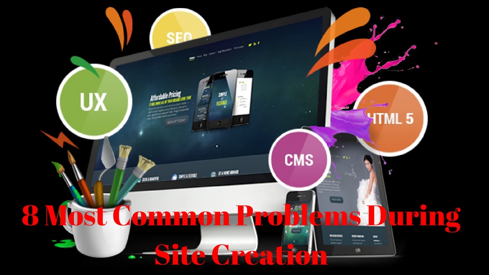

As we promised you, here are the most common problems that arise during the development of the site.
NEEDLESSLY COMPLICATING
Often it happens that the site's infrastructure is further complicated when there are a large number of pages or different products, many categories and subcategories or several different navigation menu groups. Then it is a complex structure, but it is for this reason that it should be simplified as much as it would not be too burdensome for users to move through such a site.
The simpler, the better - it should be a mantra for everyone who deals with the web design. Even when it comes to a less complex site, you should simplify the steps users will make.
A good example of how you should not design is Vitaly Friedman, editor in chief and editor for Smashing Magazine, in the text on the functional issues to look after, pointing to the text of the Google logo that was published on the Wired magazine website and distributed (unnecessary) on eight pages.

As Friedman states in the text, this can be an opportunity for more ads on each side but makes the article difficult to read. In addition, it creates a problem in SEO optimization, because when content is spread across eight different pages, it's not so easy for Internet browsers to point out that it's about the same topic.
So, when you make a sketch for a website and finally create a prototype, we advise you to:
colleagues designers are given the insight and ask them for an audit, with answers to:
- questions about whether everything is in place, whether it is something extra or something is not clear enough and if they would solve something differently to make it look - it might be taken away a bit of time, but it can be of great importance for making a flawless final solution
- if you are able (read: if the deadline does not expire in a minute and you end up at the last minute), leave the completed version of the site to stand one day and review it yourself - do you now see some minor errors or you think that something should be replaced, change, delete?
Correct everything you need and always thinks about the importance of simplifying.

COPYING OTHERS
When it comes to creating web applications for which there is strong competition at the world level, it can often happen that each new interface in the same area is created by the reputation of the already existing to be recognizable, as users are "so accustomed."
This may point to the problem many designers are facing, fearing to step out of routine or to try something new, and only for one reason - the fear of the unknown.
Let's take for example an application such as Viber, WhatsApp or Skype - all of them more or less look similar and have similar functions. It certainly makes sense, but if a new application of this type appeared, it could achieve even greater success if it were different, if it offered something new, different, unseen by then.
It is understandable that everyone feels best when doing what he/she knows best and when he/she is certain of what he or she knows. Still, you should not be afraid of the steps outside the trails and create something completely new.
When designing a website, do not, of course, lose sight of what competitors in the same industry do, but do not just copy or make approximately similar solutions. Make a little more time and effort and invent something original, innovative and unusual. It will pay off.
"USERS WILL UNDERSTAND THAT"
When a problem occurs on the site, some element that does not work properly or a slow-loading page, designers may ignore correcting such mistakes thinking that "it's nothing terrible", "users can override it" and "They themselves will understand what to do".
These are all assumptions that should be avoided. If you know that the user experience might be unsatisfactory, there is anything that could negatively affect the overall impression visitors have of using a particular site or application, correct it. The solution always exists.
"USERS WILL NOT UNDERSTAND THAT"
Web design should deliver simple and clear solutions, but if, in the end, you try to simplify and break existing elements into atomic parts so as to be as clear as possible to users, you can easily fall into the trap of underestimating a site visitor.
If you feel that nobody understands and will not be able to deal with the site himself without detailed instructions for use, there are two possible reasons for this:
- Negative thinking about the knowledge and technical abilities of users;
- the design is not well-designed and needs to be redefined to make it clearer.
Visitors to one website usually do not have too many expectations. They want to find what they are looking for and do not want to waste a lot of time on it. The task of the designer is to enable it, but also to contribute to the rich experience.

(NON) ETHICAL DECISIONS
Will some of the functions or features available on the site lead to misleading users? It's a question that every designer needs to ask before creating a solution. Deceptive options will definitely not make users feel comfortable and can easily turn a good design into a bad one.
When we say misleadingly, we mean the so-called dark side of the design of the user interface (dark patterns), in which the forms are placed on the site, for example, forms that fraudulently collect e-mail addresses of users.
By leaving their data, users usually get something in return, which can be access to certain files, free ebooks, discount online shopping, e-course insights or anything else. However, none of the users have been notified that, for example, by leaving their address, they automatically log in to the list for obtaining daily, weekly or monthly newsletters from the company of the site, but also from all third parties associated with it, which may involve a large number of ads.
Just because they do not know the background, users do not have the opportunity to decide for themselves whether they really want it or not, which can be extremely frustrating and very negatively affect the visitor's impression of the site.

According to the description on the Dark Patterns portal, there are 11 different types of manipulative forms:
1. bait and automatic switch to an unwanted page, feature or option on the site
2. hidden ads
3. compulsory continuity
4. spamming a friend of users
5. hidden costs
6. deliberately distracting the user's attention to a certain element, so as not to notice something else
7. abolishing price comparison options
8. "Confidentiality" (named after the founder of Facebook Mark Zuckerberg, since it implies public disclosure of much more information about himself than what the user intends)
9. "Motel full of bugs" - means a situation where users can easily find themselves, but they can hardly get out of it
10. Disguised addition of the product to the user's basket when online shopping
11. trick questions.
In a situation where a web application or site for a client is designed which requires that such options appear on the pages, the designer may not have a great choice. However, knowing how badly it can affect the user experience, it is in some way a moral obligation to warn the client of all the bad aspects of such solutions and try to influence the eventual change of demand.

IRRITATING NOTIFICATIONS
One thing is certain - users do not like aggressive applications, messages that are constantly appearing, non-stop notifications and any similar kind of pushy access.
In order to avoid this, when creating an application or website, it is necessary to turn to psychology and analysis of user behavior.
Namely, good applications are those that create the current cognitive link between emotional needs and solutions that a particular service or product provides. In order to do so, the so-called triggers, in the form of messages or notifications, should arrive at the right moment.
How do you know when is the right time to place an announcement on the application?
A good example can be found in the text Psychology of Notifications, published on the Tech Crunch portal, which states that those who have between 40 years of flight and only 40 minutes to check the cards, immediately after landing, probably worry about how they will arrive next summer and how long it will last. But if, as soon as the phone is switched off from the airplane mode, a notice from the airline comes in with all necessary and up-to-date information, which means it has arrived at the right moment, when passengers already become slightly nervous, wondering if they will reach the next flight.
The text explains that digital products, which in some way create a habit of use, are designed to recognize the moment when an internal trigger is triggered by the user (an emotional need) and at the same time trigger an external trigger (a notice pointing to a solution).
The problem with poorly designed notifications is that they are often irritating, inadequate and excessively common. Users simply ignore such notifications and often stop using an application precisely because of the frustration caused by an aggressive approach.
On the other hand, by linking carefully designed, useful and well-balanced triggers closely related to the deeper needs of users, designers can make notifications that people really want to get and need.

INADEQUATE NAVIGATION
If, during the use of the site, users in some way turn into a circle, if they fill out a form that returns them to the beginning, if they can not find the way to the desired information, they become confused by the excess number of categories and subcategories of a similar name or purpose, if they cannot step to return to the homepage or anything, this means that the navigation structure on the site is not well placed.
Users at any time on the site should know where they are, how they came to, why they came there and how to get back. Navigation must, therefore, be obvious and logical. Even if users are "lost" using the site, there must be an option that will help them get back on the right path (breadcrumbs).
WRONG PERSPECTIVE
It may happen that, as a designer, you do not notice that you are mistaken in something, since you look from your perspective, knowing what will be all on the site and how it will look, which page is there, whether there are shortcuts, what buttons it also presents what happens when it clicks on it, as well as everything else related to the design and usability of the site.
What, however, you always have to keep in mind is to change the viewing angle - from your own in the perspective of the user. That's why it is necessary to conduct a thorough research on the habits of consumers, customers, and customers from the area for which you are designing so that you can walk in the direction of the target group and navigate through the site as they move. This way, you will find the easiest way to find faults or errors if they exist and you will be able to correct them in time.
WHAT ELSE CAN HAPPEN?
UX designer John Crabb has compiled a list of 100 problems for UX design, which in everyday situations point to examples that can be practiced, but also on possible solutions, potential risks and way of thinking leading to proper decision-making during the design site.
Some of his tips include the following guidelines:
- Get in a completely unknown city
- Fill moments with something interesting
- Organize things in the closet
- Take care of all messages from all platforms to be answered
- Know what, where and how you throw and how to recycle
- Nobody likes waiting in line, do something about it
- use a stopwatch
- locate your locked bike and be informed if it's moved
- Prevent your car from stealing while you are on vacation
- Make it easier to donate for humanitarian purposes.
And to conclude - do not be afraid to try something new, experiment, learn from errors, always look at everything from the user's perspective and you will not make a mistake.
Follow me on Twitter - @SrdjanKali.
Share the News