


Choosing fonts is a job that always moves from the designer, but in this task, you have to pay attention to a number of factors that can affect the final outcome of the graphical solution that comes to mind.
Do you need to pay attention to readability or legibility, how this choice will affect the overall design and whether you need to satisfy your client or target audience in aesthetics - that are just some of the questions, whose answers are hidden in the text below.
WHAT IS THE GOAL?
Before you start a new project, you should first consult with the client about expectations. The target audience, the intent, and the ultimate effect that graphics should cause are things that should be managed from the beginning to the end.
However, the design problem is that it constantly clashes between subjectivity and objectivity. Often it happens that the design you like the client completely rejects, and vice versa - that the client's choice is completely contrary to the solution that the designer suggested as the best.
For this reason, it is necessary to take care of several things that you must to know which will determine the further course of style selection, the existence of glyphs (patterns, graphic forms), the existence or absence of the serif, the appearance of the diacritical signs, and the like.
READABILITY OR LEGIBILITY?
There is a difference between readability and legibility, and paying attention to one of these two items is conditioned by the final message that the graphics solution should send.
Legibility involves the design of style type (glyphs, serifs, etc.). If the purpose of the text is decorative, legibility will be very important.
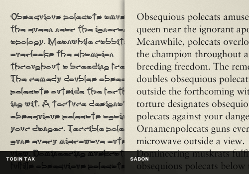
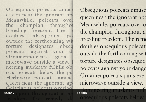
So in the example below, we have two fonts: Tobin Tax and Sabon, which differ in their purpose. The first one has a decorative serif style whose readability in larger texts is bad (for example, it would be more functional in shorter ones), while the legibility of the other font is better and can be used for larger texts.
Readability is above all driven by a communicative principle. It is important to us when we choose a font for a larger text that needs more time to read. The appearance of letters must not be tiring for the eyes, the gap between the graphs should be sufficiently adapted for easy reading and there are no major deviations, and often from project to project, the goal and target audience will be different, so it should be adapted to different needs.
In the example below, we have a Sabon font that is adapted for better readability, in the case of a left-hand color, it is brighter and the alignment is on both sides. A little change really makes a visible difference.
COMPLIANCE WITH DESIGN
The purpose of the design must be carefully considered. Subtle differences (as in the example above) can really help to accept the solution as best or completely rejected as bad, so it's important to keep in mind the essential things to know when choosing a font:
- The font should be unique
- It must be adapted to the screen size
- He must resist the time
- It must be in line with the needs of the target audience
AESTHETICS
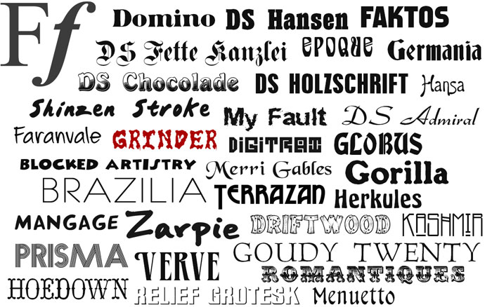
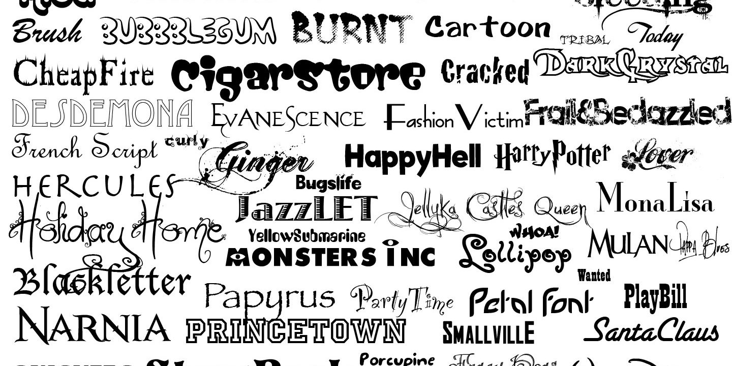
Although the choice of fonts is a fairly subjective matter, general aesthetic principles should also be kept in mind, which should also be guided. The message that the selection of the fonts sends will vary from project to project - how the area or industry you are changing changes, so the combination for which you decide will also change.
5 PRINCIPLES FOR SELECTING THE RIGHT FONTS
- Choose a font for this occasion only
- The combinations are done by grouping the font families
- Be brave, that is, follow the principle of noticeable contrast
- Be moderate
- Rules do not exist
A FEW WORDS FOR THE END
At the end of each project, remind yourself that typography is really a kind of art and that all the decisions that you make are mostly imaginative - because in order to do it differently. Try yourself to test your choice - read the text and make sure that the font is pleasant to the eyes, whether it is legible, how readable, whether it is aesthetically acceptable and whether it fits with the design. It would not be bad to give other designers or friends to also explore the project and point to possible failures.
Research should become one of the everyday goals you need to set yourself up in order to improve your knowledge and expand the font selection options.
Share the News