

Do you believe in your intuition? Do you rely on your inner feelings when you meet someone else? Do you believe that we really have those famous "Seven seconds to leave the first impression"? And, do you know that the same situation with the sites?
You will often have only one opportunity to impress (and hold) the people who first visit your website. Therefore, in the first few seconds, you should coax them with:
- charm,
- innovative,
- humor,
- uniqueness,
- the amount of useful information.
If you can break through this first strike and keep visitors on your site, you must not stop. Additionally, you will grow in their eyes if you have original illustrations or use interesting special effects in interaction.
From the first contact with your site, you should (hypothetically) grasp the user by the hand and take him to a tour of your web site or online store to:
- explain who you are and what you are dealing with,
- show your knowledge and skills,
- You proved that you are an expert in your business,
- detailed refer him in all products/services,
- explain how you can solve the problem or provide an answer to a specific question.
Yes, you could view your website as a kind of tunnel through which visitors should pass from the starting page to their destination. Do not create an overly complex structure so as not to cause users to leave the site.
Instead, make sure you create a seamless user experience (UX design), a functional user interface (UI design), and in this way contribute to an increase in the conversion rate.
How to make the UX design principles positively affect the achievement of your goals and increase your site's conversion?

WHAT IS THE PURPOSE OF YOUR SITE?
You should first set a clear goal that you want to reach with your website. Goals can be diverse and will depend mostly on the purpose of the site.
The goal, therefore, can be online product sales, ordering services, scheduling treatments, booking accommodation, ordering professional literature, comparing universities around the world, comparing the price of computer equipment, implementing digital tools, downloading software solutions, or anything else.
You can have only one, the ultimate goal, or even a few smaller goals that will be later, by cumulation, leading to the achievement of the ultimate goal.
If you run an online reservation system, your ultimate goal will be achieved when someone books an apartment through your site (if this reservation is not canceled later). If you have started a business with professional online courses, smaller goals could, in this case, be downloaded free course books, fill out a contact form that will require more information, and finally - user registration and course purchase.
So far, we believe, it's already clear to you that when we say the goal, we mean conversion. Because every achieved goal on the website is counted as an increase in the conversion rate.

WHAT IS CONVERSION ON A WEB SITE?
If, for example, you sell handmade jewelry through your site, you'll count the conversions taking into consideration visitors who made a purchase in relation to the total number of visitors to your site. If you have, for example, 10,000 visitors during the month, and 1,000 have made purchases, that means your conversion rate is 10% on a monthly basis.
When we say conversions on the site, therefore, we are talking about potential clients that you have transformed into those who have made the desired task. The bonus is, of course, if they continue to return often to your site (and not to the site of competitors) and become your loyal customers.
If you do your best to make your website as good as it is, rich in useful information, easy to use, you can easily accomplish it.
We are talking here about people who have noticed that your product can help them, and then they have gained trust in your brand and realize that they can buy with you the reliability over and over again.
We are also talking about those who may have logged in on your mailing list, but which you then delighted with the inspirational, original content that you daily send to their e-mail box, so they learned that they can use a secret promotional code that will save a large amount of money only because they are your subscribers.
And our story, of course, also applies to those who may not have been accustomed to buying online, but you've enjoyed them with detailed information about your products and ease of payment, and are pleased to be your regular online shoppers.
Each of these and similar situations leads to an increase in the conversion rate.
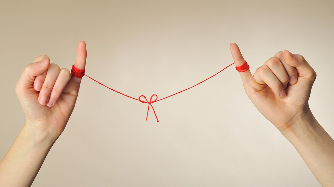
CREATE AN EMOTIONAL CONNECTION WITH USERS
Numerous studies have shown that when buying, or any other interaction with brands, people respond much more emotionally than rationally. This is clearly evidenced by the statement by Maya Angelou, African American writers, actresses, and civil rights activists, who fought along with her friend Martin Luther King.
“People will forget what you said, they will forget what you did, but they will never forget how you made them feel.” - Maya Angelou.
And that's totally true. That's why it's important that the visitors fall in love with your website during the first visit. Because you will not have a second chance to make the first impression.
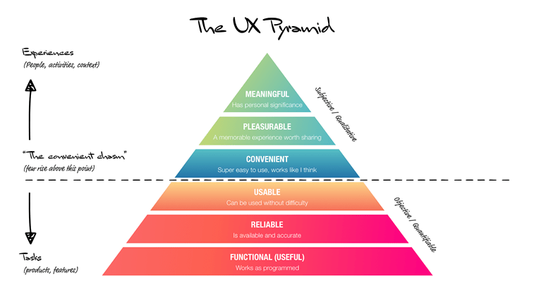
The significance of emotional connection is also indicated by the so-called Pyramid of the UX design. Basically, this pyramid has the functionality and reliability of the site, which to a large extent means to users when evaluating a site. In the middle are high use value and ease of use, as important aspects of UI / UX design. And at the very top, as the most important value of a web site, the significance, ie the personal connection of the users with its purpose, theme, use, etc., are emphasized.
WHO IS YOUR TARGET GROUP?
We come to another important item, which is a research related to the target group, online software, mobile app, e-store or any other business.
Do you know the path that your potential customers or customers are going through - from the emergence of a problem that you solve with your product to finding for solutions, finding you and your competitors and finally making a decision for which product will decide?
Here are the short guidelines that you should keep in mind during the UX research phase, which can help users decide for you:
- clearly define the target group,
- create a so-called user persona to help manage the research process,
- explore their habits and online behavior,
- Find out what problems users often encounter,
- Try to incorporate the solution to these problems into your digital product.
We recommend that you rely on the principles of the so-called Design Thinking method, which implies empathy for users, understanding their problems, finding as many ideas about potential problem solutions, creating a prototype design, testing prototypes among members of the target group, and, finally, finalizing the look digital product.

CAREFULLY CREATE THE STRUCTURE OF THE SITE
When you completed the research phase and clearly defined the target group, find out what the user's needs and their habits and expectations are, you should focus on the information architecture.
This part of the site development process is aimed at setting the quality foundation for a later upgrade. The correct setting of the site structure, creating a map of the site and navigation menu are just some of the steps that you need to pay attention to within the information architecture.
In addition, the steps include:
- determining the hierarchy of structural data,
- categorization of content on the site,
- determining the types of site pages,
- organization of the structure of individual pages,
- determining the layout of the elements on the pages,
- creating a framework, sketches and a web site model (wireframes)
To create a functional and useful website, you should pay special attention to each of these steps.
In addition, each step expected from a site visitor should be self-explanatory and follow the logical trail, that at any time the user knows where exactly is, how to go back, how to correct a potential mistake, and how to Realize your original idea.
It is always recommended that you keep detailed documentation for each project as this will facilitate the work of the entire team involved in the web design process.

CREATE A UNIQUE LANDING PAGE
When you have a firm foundation for the site, it's time to focus on creating individual pages.
Landing pages design is something that you especially need to take care of, and in this context, in particular, about a few items.
A landmark or targeted page is any page on your site to which users come through organic search terms that interest them or by clicking on some of your pet products or with the desire to get more information about the topic for which you are an expert, even if they want directly contact you through your site.
The landing page, among other things, may be:
- home page of your site,
- page with a portfolio of your works (if you are, for example, a freelance designer),
- each individual product description page (if you're dealing with e-commerce),
- page with the ordering form of the product/service,
- page with the contact form,
- an article with an article on your blog.
Each of these parties should pay special attention and, depending on the purpose of the site, design it to contribute to better user experience and even increase conversions.

How to create pages that bring profit
Content design and layout are very important components of the UX and UI designs.
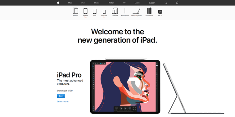
It should be on the sales side, in the part that is visible before it scrolls downwards, exactly what is needed. If, say, it's a product page you're selling, whether it's a lesser-known brand or product such as Apple's iPad Pro, it should be the following:
- stunning photo products,
- Short Description,
- the price,
- a shopping button, which will clearly write 'Buy,' Order ',' Buy Now 'or something like that.
Do not be fooled by this in the case of a brand that is well known globally and you feel that it is only necessary to present a new model of its devices so that millions of people can buy it without thinking. There are truths about it, but here is another fact that needs to be kept in mind.
Below the page for iPad Pro, there are a few more excellent photos from different angles and some of the main features and performance of the devices featured in shorter blocks of text.
Additionally, there are four additional pages for the same product - a comprehensive overview, design, technical specifications and answers to the question of why the iPad is. On each of these pages, besides photos and promo videos, there is a text with detailed descriptions of everything that users can do before they decide to shop. On each page, there is a text with more than 1,000 words, which means that Apple created unique visual content and more than 4,000 words for a detailed description of the product and its performance for just one product.
So - more than 4,000 words; for one product; on the Apple website.
What do you think, how much percentage of conversions occurs only on that basis? We do not regret the metric from the site of this company, but there is no need for that. The question is rhetorical.
Tip: Whatever you sell online, you should provide enough information for your users in a creative and original way. Everything needs to be in line with your brand, all described in detail, with photos from multiple angles, video content, complete technical specifications and - it is recommended - with a transparent price. In this way, you give people confidence and give enough relevant information on the basis of which they will make a purchase decision.

RESPECT YOUR USERS
Ethics in the field of web design and user privacy protection is certainly a topic that is increasingly discussed and designers increasingly take care of it. However, it is always good to remember some basic guidelines in this respect.
Recently, UX designer Cyd Harrell explained in his article for UX Collective that, if she had to extract one, the most important value that is significant for UX design, she would say that it is respect. Respect for users.
Because, only when you treat people with respect, they will respect your reputation and more than that. You can easily become your loyal customers or customers or users of your services.
Another very important thing about respecting users is the commitment to protecting personal information and the correct use of the form on the site, pop-ups, banners and promotional actions.
It is always commendable if you are ready to offer a discount or allow site visitors to download an interesting and useful reading free of charge but try to never abuse it.
First of all, it is not recommended that pop-ups, ads, and discount coupons be over-attacked on the site. They should not occupy the whole page, do not need to deconcentrate, nor in any way obstruct the use of the site.
Secondly, you should not use unwanted actions that you will be scampering to allow someone to leave their email address, which you will later abuse for aggressive advertising and sharing with third parties.
It is recommended that:
- always in the forms collect only as much information as you really need,
- be transparent and do not abuse the trust of your users,
- explain exactly what information you collect and why
- you do not rely on the default consent, but give the opportunity to users to decide whether they agree to something or not (this is, after all, also prescribed by the Law on Personal Data Protection, as well as the European GDPR Regulation).
If you would like to learn more about the legal framework for protecting private data in detail, the SHARE Foundation recently presented its Guide to the Privacy and GDPR Law, which more or less applies to all those who operate online and in any way process personal information individuals. The guide is available in PDF format.
In addition, Smashing Magazine has recently launched a series of texts on user privacy on the Internet, in which Vitaly Friedman speaks precisely about these items, which we point out as significant when creating the form and (evil) use of personal data of a visitor to a site. So far, the first text about UX Privacy has been published, and it is planned to be three more sequels.
Additional advice for the end: Carefully build your brand, show potential customers that they can trust you, have a high-quality product, hold your word, work passionately with your business. Also, show understanding for your audience, feel with them, show that your brand stands for true values and, we are sure, you will soon have a much larger number of faithful followers (on social networks) and loyal customers (in real life).
We hope that we have managed to answer the question of how you can positively influence the conversion rate on your site. UX design can really help you with this, with meaningful audience research, the correct layout of the site structure, and the careful creation of landing pages.
We believe that these guidelines will benefit you if you want to increase conversions, so you can successfully achieve your goals.
Share the News