

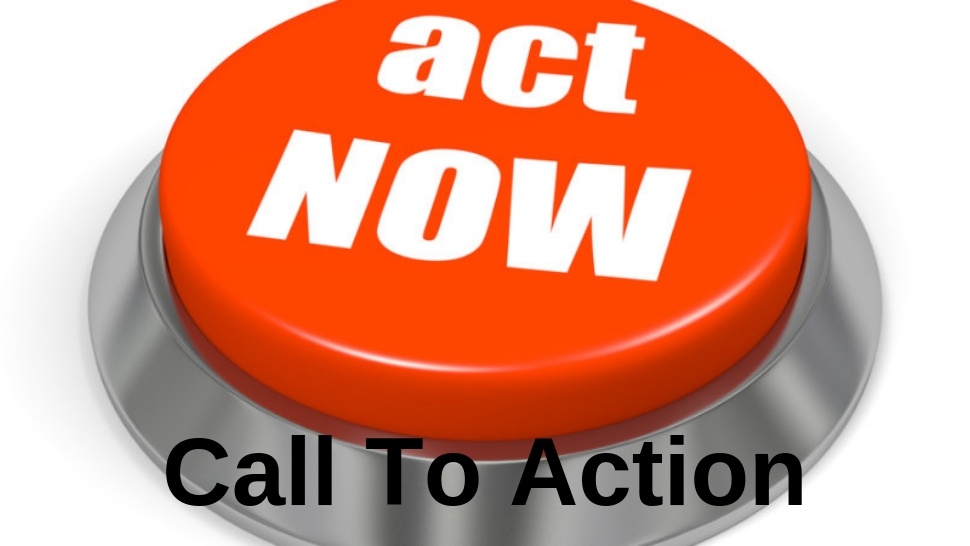

If you have your own website, you are probably constantly listening about this famous Call to Action. What is it, and why is it so important?
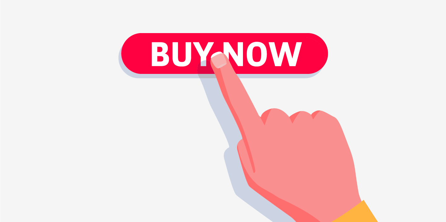
Call to action or shortened CTA, is the term that has infused into business water from marketing. You've seen countless websites of various colorful buttons with the required "buy now", "find out more," "order today," "sign up" ... These are all calls to action. The most common are those colorful buttons that your moms click on, but they are often in the form of a banner, although you can also see them as the most common link.
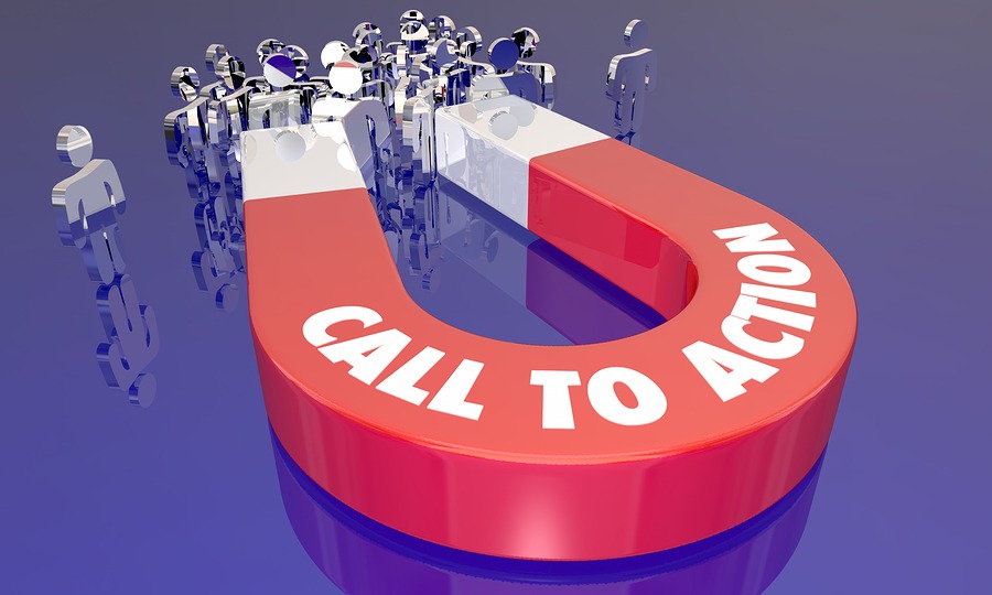
Their job is to put people on the next action on the site. After reading some article on the blog, below it you can find the CTA that offers you to download a free e-book about the topic that you just read or to register to the newsletter of that blog.
Calls to action are an inevitable part of the sales pages. Here, and the text on the site plays an important role. Its goal is to persuade potential customers to take action because you are just offering a product or service that is right for them. That's something they did not even know they needed, but now they need them so much that they want to contact you right away. It's an ideal scenario for good text and call-to-action should work. Of course, the reality is far from it, but there are ways that your CTA button is not just a nice visual add-on on the site.

KEY POINTS OF CALL TO ACTION
When thinking about CTA on your site, you have to keep in mind three key points:
- where the call to action is positioned;
- what it looks like (whether it's a button, a picture, a banner, a link ...);
- which text is on it, but also what text it precedes.
Whether you put a call at the end of the text or on the side depends heavily on what content is also on that page. If it's an online store, it's best to have CTA below any product you offer.
If it's a blog article, the call to action is mostly below the text. Want visitors to make a profile on your site? Try to install the registration form from the side in a visible place.
When it comes to appearance, let your calls to action be striking. Watch the button to be vibrant, but to be in line with the rest of the page - to attract attention with the taste. Be creative when CTA is in question. Design the button in a special way, place the link in the banner that you will again design to capture the visitor's views. It is only important to clearly see what needs to be clicked, to be visually attractive and not to look like a paid (other) ad.
The text depends on the action you want visitors to take on your site. Make sure it is concise. You can write something a little different from standard messages like "order", "register", "call" to differentiate yourself from the competition and draw the attention of future customers.
TIPS FOR YOUR CALL TO ACTION
The thin line is between too much and too little CTA. Do not place too many buttons or banners on a single page, because users will not know what is expected of them and it may happen that they are too complicated with too much information. In such situations, people will just leave your site. And that's what you do not want.
Some experts believe that on every page you have must have at least one call to action. Either way, watch that you have one on your sales page.
Also, it's important that visitors to your site know what they are clicking and what they agreed with. Be transparent when calls to action are concerned. You will save in your database the e-mail address and the names of the people who subscribe to your mailing list? Notify them about it in a small bubble or text below the form in order to know which data they will share before they apply.
Another of the marketing tricks that you can apply to attract consumers' attention is to offer a trial period option. In this way, instant buying is avoided, but during the trial, consumers can determine whether your product or service favors them.
Also, free gifts with the purchased product attract customers and make shopping easier if they get something completely free (even at the price that they do not need this free gift).
If you want to shorten the time customers spend in considering your offer, you can limit your time. Emphasize that a product is available only today or is only available this week on a discount. This psychological trick will affect some people from making purchases faster.
There are many ways to inspire consumers to open their wallets. Calls to action are just one tool that, along with rounded page content on the website, further invites visitors to click on a button, image, or link and leave their private information. You will certainly not leave your information to a site that seems unreliable to you. Therefore, seriously devote to the task called calls to action.
We wish you a lot of luck in designing your calls, and for the rest, you already know about the old blogger saying - sharing is caring.
Share the News