


If you've ever wondered if you would be wrong about some design principle when you combine serifs with sans-serif fonts, and you did not know where to look up the answer to that question - you're right! In the next few paragraphs, we will give you 6 helpful font matching tips on all your projects.
HOW TO FIND EXACT MATCH TO SOME FONT?
1: CONTENT IN THE FIRST PLACE
Following the Content First Principle, you first need to ensure that the content you need to edit is a typographical god.

The content is designed first because it must be relevant, useful and just right (otherwise you will make a big mistake), and then follows the attention to the content by selecting the typography. In other words, never use the lorem ipsum text to test fonts in the design template because it never reflects the final look of the design.
2: SIMPLICITY
The advantage of the 21st century is that we have a lot of free resources available. One simple search on the Google search engine will give us a number of options - you can end up with countless fonts that you will not even be able to use at the end. Not to mention the combination of several different fonts in the same design. Respecting the simplicity principle, you can use up to two fonts - one for the title and the other for the body of the text.
The advantage of most fonts today is that they offer different weights (bold), and you can use them without compromising the simplicity of typography. So, for example, You can use a font with a lower weight in e.g. quotes, which should certainly attract attention.
The pairing of fonts should also follow the principle of simplicity, which we find in nature and mathematics.
THE RULES OF GOLDEN PROPORTION (Fibonacci sequence)
The rule of gold proportions is based on the Fibonacci series. The Fibonacci sequence starts from the numbers 0 and 1 (in some cases, 1 and 1), in which each subsequent number in the series represents the sum of the two preceding numbers by the formula:
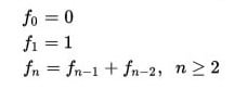
0 • 1 • 1 • 2 • 3 • 5 • 8 • 13 • 21 • 34 • 55 ...
So, for example, The title of the size of 20 pt corresponds to the body of a text size of 12 pt, which is proportional to 20/12 = 1.6 (approximately).
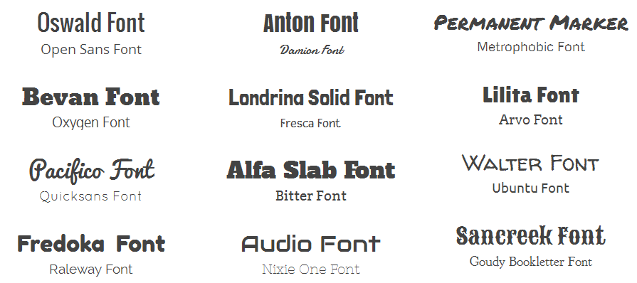
3: CONTRASTING
Although we have already written about 10 typographic orders, it is not fierce to repeat and emphasize that we should not use fonts from the same family, nor a combination of two serifs, or two sans-serif font. The solution for this is the simple use of fonts from different families, in the connection between the serif and the sans-serif font (one in the title and the other in the body of the text).
4: LEGIBILITY
If you have come up with a particular combination that you like, it needs to be tested in terms of legibility. Although it seems to you that some font is legible, it does not necessarily mean that it will be legible in combination with another font.
So, for example, you should not use handwriting fonts in the body of the text, because they are usually reserved for titles or some other design elements that are usually short.
It should also be kept in mind how the typography will look on different devices, or whether the font will be sufficiently readable on the mobile device as well as on the computer.

5: USEFUL RESOURCES
It has already been noted that on the Internet we have fonts in abundance. We've already written about some of you and offered you a free download, but if you still did not find the right one, here are useful resources.
Google fonts
As today's sites are mostly made to be optimized for search engine Google, this giant has also offered its own font selection. By creating the Google fonts site, this company has made the service to all designers because 804 fonts finally became available (read: free) for download. Another benefit from this site is that it is possible to compare the fonts and their features in a nice design. The dream of every designer!
Font pair
Another useful site, which does not originate from Google cuisine, is Font pair, which offers suggestions for using sans-serif and serif fonts in the body of the text and title, and vice versa. It's worth a look!
6: EXPERIMENTING
After all, everything comes down to an experiment. Try different combinations and see what goes with what and what does not. Although the point of these tips is to shorten the search time and accelerate effectiveness, some things cannot be predicted or mathematically calculated, and it is best to let go of the moment and choose the one that intuition requires.
As each design is specific, such should be your decision too.
Follow me on Twitter - @SrdjanKali, or our Facebook page.
Share the News