


Year after year, we look at them again; dozens, and hundreds of articles on the Internet about trends in. Everyone has something to say about this topic, but it seems like everyone is writing the same text over and over again.
Why?
Because, in reality, nothing new happens. There are no truly "trends" that designers follow or create.
Do we miss anything? Is the problem that designers do not have time to think something new, something that will forever change the web? Or are we looking for answers in the wrong place?
It would be said that this is the second. Specifically, web content writers want to be trendy and are sticking to the latest design trends and then writing about them. But the truth is that writers do not dictate trends in design. What they write will not be accepted by the magic wand as a trend. What the designers are doing, they will. Their creativity and inventiveness, in fact, are what we all should be looking forward to.
New styles, flat design, playful fonts, animations, illustrations and the use of bright colors - all this is not passé, but a regular phenomenon in the web design world. Something that Internet users are expecting.
What is unusual then? In this article, we will try to present our overview of what we see on the web and what we still want to see.

1. Quality Storytelling
Each website has its own story. Without a good storyteller, your site will be left blank. As such, it will not attract users and you will not achieve your goals, however, you have imagined them. It is therefore crucial that your user experience (UX) knows how to witness stories. Otherwise, your site's design will look generic and look like many others on the Internet.
One of the first steps in good web storytelling is to create a good site structure, which will include simple elements, based on which users will be able to understand (within five seconds) what are the main functions of the site and what needs to be done next. Most important of all: do everything super simple, that is, keep it super simple.
2. Asymmetric Appearance
For the languages that write from left to right, the layout of the website means reading the text from top to bottom, which means that the content should stretch to the bottom of the page. Thus, the website is in the form of a vertical rectangle. And everything on it is aligned and symmetrical.
To avoid this, you can play with the asymmetric appearance of web pages, as well as with text content or sections of the site that will not come from the top to the bottom, but, say, from left to right, in a circle or in some other way direction. Do not be scared of experimentation, especially if a client is willing to try something new.
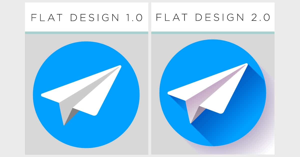
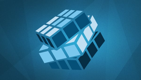
3. Flat Design 2.0
The so-called flat design has been used to create websites for five years (some would say it's been a lifetime), but it's still not outdated. In fact, he evolved into flat design 2.0 or semi-level design, which still makes it relevant. What version 2.0 brings new are shadows. Someone might think that this is essentially a material design, but it is not. It's fascinating how one such simple addition as the shadow can add depth to your perfectly designed flat design.
We see that designers experiment with gradients and 2D graphics, and the new flat style is completed with the possibility of shading and will make their work even smoother. Many well-known brands, such as Instagram or Dropbox, have applied such a style in their branding and we believe that we will still see it on the web in 2018.
4. How Much Can We Be Minimalist?
It sounds like a philosophical question, but that will not stop us from trying to answer it. The essence of minimalism is that a small number of elements have many things to say. Artistic minimalism sometimes has no other purpose than art to art. In web design, however, a minimalist approach serves to attract users attention and focus on the desired elements.
Minimalism in modern architecture, for example, can serve as an inspiration to modern web designers. Geometric abstractions, real angles, and ease of color choice can characterize your project as a minimalist one. And remember, you can never be too minimalist. That is the power of such an approach.

5. Illustrations On Photography
Illustrations are a true trend in web design for two years, but what is more and more present in 2018 is the use of unique illustrations in photographs. Ordinary photos, posters, and other items on one page can be refreshed by adding hand-drawn illustrations, making them striking and appealing to users. By emphasizing certain graphics components through web design, photos can become more attractive, especially if the site's theme is related to fashion, cosmetics or food.
6. Interactive Indicators
The basic purpose of interaction design (IxD) is to hire users. The term is transferred from the physical world, specifically in the field of interactive products, and is quickly accepted in the digital world when designers began to devise ways to use a number of cognitive and physical characters to guide visitors to a specific goal on the website. The goal is to facilitate access and stimulate interaction.
In the digital world, you should guide users through the so-called funnel, or channel their activities while staying on the site so they finally find exactly what you would like to find, whether it's a contact form, sign up for an email newsletter, buy button or any other call to action (CTA). The more time visitors spend with you on the site, the lower the bounce rate - and this will mean that you have succeeded in your intention to be interested in what you offer.
On the other hand, static websites have grown into a new race, but with numerous challenges, such as the question of usability and focus on achieving goals, just waiting for the moment to be suppressed. If the attention of your users is fragile and you do not have much space for animations or unusual transitions, you can easily create an interactive pointer or cursor, which will be interesting whenever it is dragged over a certain item on the site (hover) the next step or the desired filling form.
7. The stunning transition from page to page
At a time when websites are more and more like one another, you need to separate from others and offer something new to users. Bearing in mind that scrolling has long been standard and that the interaction with mobile screens with one swipe is transferred to web applications, there is a need to create new, charming and fascinating transitions from one website to another.
Animated transitions, for example, could add extra freshness to one classic page, making the transition to each next page a creative experience for users. So if you want to improve the user experience, try yourself something similar on your site.
8. Mobile First And Progressive Applications
The progressive applications and the approach that puts the use of mobile devices in the first place, especially the so-called accelerated mobile pages, AMP, have brought us something really interesting. At a time when more and more people access the Internet from mobile devices, it is necessary that each website has a responsive design, as well as a focus on the development of sites for users who primarily access from mobile phones. This means that a site or web application should be created primarily for use on portable devices, having in mind the experience of mobile phone users, with the addition of features that the user will continue to interact with the application itself.
That's why we expect that progressive web applications will be increasingly present in 2018.
9. Floating Menu
Navigation is the central point on your site. If you miss in the navigation structure, many other things can go wrong because of that.
In recent years, for example, we often saw the so-called hamburger menu on a large number of sites, but the problem with it is that it's not very intuitive to me. Users initially did not know how to use it, and then suddenly moved from mobile web applications, where it became even more enigma. We conclude, therefore, that its use was not such a good idea at the beginning.
There is a static, "glued" menu that is useful, but on some sites, it can work too often. We hope to see more websites with a floating menu, which remains in its position as it scrolls through the site, so it is always easily accessible. If you have not had the opportunity so far, try using such a menu and tell us how it seems to you.
10. Winsome Aesthetics And Loading Speed
As technology progresses, we see high-profile screens from day to day, while resolutions on mobile devices become sharper and clearer. Under such conditions, it is necessary to create stunning graphics elements of impressive aesthetics. Hand-drawn drawings enhanced by the digitization effect, 3D objects or other multidimensional graphics that will attract visitors' attention and make them stand in front of them - all this should be found on your site in the upcoming period.
On the other hand, however, the problem with multilayer and aesthetically satisfactory graphic elements is the fact that they can be quite difficult to load. Bearing in mind that Gugl has announced that the page load speed will be one of the main factors affecting positioning in search, especially on mobile devices, the optimization of images and 3D animations must be taken into account. The only way is that with the help of the optimizer, such elements are compressed, so they are reduced, but they do not lose quality.
11. Monochromatic Sites
During 2016 and 2017, we noticed the trend of making split screen sites, most of which were dichromatic. In 2018, however, we see more and more monochrome websites. When everything is in one color, it can act as bored or unattractive, but it's precisely the challenge with this kind of visualization.
The solution, of course, is to use the shadow as a means by which the central points on the site will be created and to emphasize exactly what you want to be highlighted. Typography can also be helpful in this case, since it can easily put a clearly worded message in the foreground so that the color comes to the fore as a basis for the text.
12. UX Writer?
This is probably one of the most controversial topics in the areas of web design and web content writing. Would designers, who do not have the necessary writing experience, have to write content for the sites they create, so that everything perfectly fit into the look? Or content writers should write, although they most often do not have experience in design or do they have "eye" for visual solutions? The answer could be found somewhere between.
Specialization for a particular field is certainly desirable, but the web design field allows for a certain amount of flexibility. This means that, if you have improved your design skills and skillfully created unique websites, you can complete one of the writing courses and thus take care of the content on the sites you are creating. Likewise, if you are already writing (as a copywriter, web content writer, translator), and you are interested in the field of website design, you can independently improve your knowledge and skills in the field of design, and also start creating sites yourself.
Share the News