


As an Internet user, you have, so far, many (and too many?) times left from one page to another, following the link for the link, walking in the most distant boulevards and winding up in the narrowest sights on the internet to find something interesting, forgetting where did you go from and why?
You may have already begun to wonder if you have problems with concentration and should you worry. No, it's not entirely up to you.
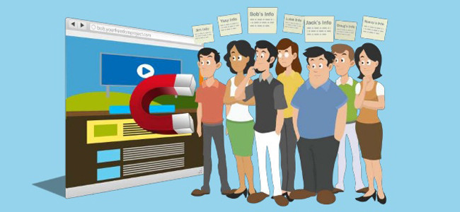
However, if you are the owner of the website to which visitors come, stay 30 seconds and continue your travels further, wandering aimlessly across the network and not remembering your online presentations from which they went on that path - in that case, you have a problem.
Diagnosis: insufficiently attractive website appearance, poor quality content, excessive quantity of advertisements in one place and, ultimately, overall - poorly designed web site.
It sounds raw, we know. But, we also know that as soon as you face the facts, you will be able to react quickly and remove all unwanted elements from your site so you can give users unhindered access and a pleasant experience while staying there.
We are now coming to an item (ills!), Which today may be the most abundant on the Internet, and it's called - lack of attention.
We hope that you are still with us, that you have not lost your mind somewhere, because we are crossing over to the essence and answering the question below - how to draw web visitors (and retain) visitors to the site?

HOW THE UI / UX DESIGN AFFECT THE SITE'S VISITING RATE?
When you handle something as fragile as attention (today), you must carefully access that task. As someone who deals with UI / UX design, you must always be a step (or two to three) in front of the users and think in the way that future visitors to the site that you are designing think about.
This means that you must also keep in mind the psychological and cognitive aspects of the personality of the user, that you know that they respond much more emotionally than rationally, and also to anticipate all possible distractions that can come from different sides and try to reduce their impact as much as possible.

HOW YOU CAN DO THIS?
To begin with, you can rely on heuristic guidelines designed by Jacob Nielsen, one of the most influential researchers in the field of UX design and co-founder of Nielsen Norman Group(NN/g).
In order to maximize the usability of the website, Nilsen points out that consideration should be given to:
- visibility of the site and readability of the content
- enough information about the current activities on the site
- control functions available to the user and the freedom to manage them
- consistency and compliance with established standards
- recognizing the elements on the site, rather than letting users remember
- flexibility and efficiency of using features on the site
- aesthetics and visual experience
- providing assistance and support to users at any time on the site.
Keep in mind that users most often can not see the whole site at once, but will somehow scan the page's page and focus on specific parts. Numerous studies have shown that most attention is drawn to parts that contrast with the rest of the page, as well as those that involve some kind of movement and movement.

TESTING DIFFERENT VERSIONS OF THE DESIGN
From the look of the site, its attractiveness and efficiency in achieving the desired goals of the visitor depending on the user experience when interacting with your site. As a UX designer it is desirable to create more options and more possible solutions, or more versions of the future look of the site so you can test everything and on the basis of the results of the analysis, make a conclusion about the best solution.
The so-called user experience questionnaire (UEQ) can also help you in this way, which is a simple waypoint to the advantages and disadvantages of each of the design solutions you design.
You need a few (and up to 1000) volunteers who will fill in the task of being your respondents and that through responses to 26 short questions that contain couples opposite each other, they express their personal experience while staying on the site, or its prototype that you test.
Questions within the questionnaire, as explained in the text of the UX Planet portal, refer to six separate areas and include:
- attractiveness
- understandability
- efficiency
- reliability
- stimulability
- innovativeness
For aesthetics, in this case, a part of the attractiveness is in charge, for clarity and lucidity, a piece of comprehensibility, while trust between the user and the website is built with the help of knowing how the site seems to be reliable and safe to use.
Pleasure in interacting with websites is measured by a scale of stimulus content, whether it affects positive or negative attention, while the part about innovation points to the extent to which the elements on the site are genuine and new in relation to everything else that already exists on the Internet.
Quality Score is ultimately made by combining three important items:
- visual impression
- pragmatic experience
- hedonistic experience
A mitigating circumstance: You can enter the results of the questionnaire in the Microsoft Excel spreadsheet and it will automatically recalculate, and this program will also show you the charts and visually indicate the positive and negative user/respondent evaluations.
After analyzing the results, you will know exactly where to proceed with the design of the site. And it will be clear to you how you can help users find exactly what they are looking for on the site, and even offer them much more than that. They will be pleasantly surprised and will want to stay on the site for longer, to explore, to find answers to the required questions or to find the products just as much or, after all, to learn something new, to watch an interesting video or to read a quality article. We must not ignore the fact that the content on the site plays one of the main roles.
Share the News