


You have decided to create a website for your company or create your own blog, for months you've been looking for a particular template that you like and you are sure that you have chosen the right one. One of the most important aspects, when it comes to websites, is to create and secure as better web design as possible. A good web design can bring popularity to your site, while a bad one can make a counter effect, which you would not want to.

Read what would be the best to avoid while creating a website and designing templates.
1. Page “In Construction”
Only when is fully ready to work you should activate your site. Probably you don’t want to open the store before entering the products for sale. Do not make such a mistake with the website. Make sure that the design and material for every page are ready and you do not place links on a site that does not lead anywhere.
2. Adjustment to Browsers
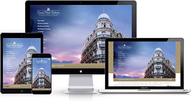
Website templates should function equally well on any browser through which a visitor goes to your site. So make sure the website is compatible with all browsers. This also applies to applications on mobile devices.

3. Do Not Fall Into Disorganization
Disorganization is chaos, and the chaotic site frustrates users and they will leave your site immediately. The visit of a site depends on the visitors who return to your site, and no one will bookmark your site if you give them a headache. It's very important that the homepage is well designed, but do not overlook the rest of the site. Make sure that the other pages are good enough to keep the visitors interested. They can include funny phrases, informative video content or a simple and nice design that is pleasant to watch. Organize everything to be easy to read, arranged by paragraphs, and make sure you do not put too much content on.
Therefore, the pages should be a unique, consistent look, but also a high-quality site creation. In the enthusiasm of thousands of fonts that are at your fingertips and even with the addition of colors, the pages often become too crowded. Use up to two or three fonts and the same amount of color per page. The idea is to convince the visitor to your stability and reliability, not to delight them with your artistic abilities. Also, remember that your fonts and colors are running well on all portable devices, mobile phones, tablets, etc.
Remember: every page on your site should be easily seen and have an option for an easy return to the home page. Why? Sometimes users will want to pass the URL to a friend, who may visit many more pages and information. If the page you get does not lead anywhere, then this is a bad solution. Always place a link on the homepage and create a logo for the site that will also lead to the home page.
4. Connection With Social Networks
Most companies have their own Facebook page, some have many images using Pinterest, and some broadcast their activities on Twitter. The business of the company has a lot of benefits from social networks that are present and constantly has a tendency of growth. Therefore, be aware that your site is linked to social networks and users should easily switch from one to another. Using social networks for your business will guide users to your site and will work only if you enable them to easily, without much effort, go to the site and vice versa.
5. Advertising in Web Design
The fact is that advertising is very important in the modern age and it is very rare to find a site without commercials, especially because it is provided free of charge in the information and social media age.
However, some ads may look nice on the site and can be viewed or ignored by the visitor, while some ads may be bothered by disturbing music or boring pop-ups, making them leave the site as soon as possible.
Ads generate substantial revenue and this cannot be avoided, especially if you use some free hosting, but try to make the advertisement not look just like commercials and you need to create a unique design that will be used for all commercials on your site.

6. Confusing, Jargon Writing or Insufficient Information
The visitor has come to your site because he wants to learn something or find something interesting and useful, but what they get is useless. Also, poorly written information is irrelevant. Visitors will not read everything on your site, but they will fall by about the page with relevant and useful information. If they are not there or are hidden in a jargon, they will not find them.
He should be able to find the information he is looking for with easiness. For example, if you are selling, you must enable visitors to find a way to find and contact you. The best way is to create the "Contact" and "About Us" pages, with basic information, e-mail, telephone, address, etc. This page should be visible on all other pages on your site.
Even though no one has ever called, only the presence of this information provides security for visitors and trust and the impression that the company is real.
7. Non-Planned Navigation
The Internet provides speed. If visitors can not quickly understand where to go and simply go there, they will simply go to another site - in your competition. Most users will stay on the home page for a few seconds until they go to the next one. At that moment, they look at the pages they can see and which can be interesting to them.
You will not start any project without a plan; the same thing is with the website. There should be a navigation bar on each side so that the visitor can easily manage where it will go. Place navigation at the top of the page or on the left so it will always be visible regardless of the resolution of the screen. It is very frustrating that the visitor must return two or three pages back to go to the other part of the site. Add a sitemap in your navigation or in a flyer to give visitors a better overview of each page on the site.
8. Disabled Step Back Button
Some site owners long ago have found a way to disable the button to move the step back in the browser so that the user can just go ahead, and some of the unwanted things that can happen are that there is some redirection to an unwanted location. The browser becomes cluttered and you cannot go a step back, or for example, pop up a window and take the whole screen.

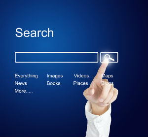
9. The Search Does Not Well
Nothing is as frustrating as when you cannot find what you are looking for due to the poor organization of the website, especially when you know it is somewhere there. As with quality links to various parts of your site, make sure that the search tool works correctly, and whether it provides suggestions for poorly typed entries.
10. Bad Links
Bad links that do not work lead to "404 error page" and this is unacceptable for visitors. Test your site, does it about once a week to make sure everything is right. By adding the "contact webmaster" link in the footer, you allow users to quickly let you know that they have found a defective link or some other error on the site and correct it right away.
11. Slow Responsive Server
The slow loading of the site is unacceptable for professional sites - and this is one of the reasons why the user will go further. How much is it actually slow? The survey has shown that online customers will, on average, wait only 4 seconds to load the site before they go to another site. If your site loads more than this, optimize it, reduce the size of the photos, because they can be too large or some special additions such as the front page in the flash or the same.
12. Old Information
There is no justification for this. It's amazing how many sites actually have old information. Make sure that your site always has fresh information and often enter new content in order to get good results. You cannot do anything bad and you will not lose credibility by entering new information, just keep in mind that they are correct. If you encounter some mistake, correct it right away.
If you avoid these mistakes, your site has a great chance to have a good traffic.
Follow me on Twitter – @SrdjanKali.
Share the News