


Otherwise, it looks as if it does not exist. However, in the sea of internet sites, it is important that your project is noticed. How to achieve that goal?
If you are a designer (or you want to become one), you should consider not only the look of the client site for whom you work but also the user experience (UX). Find out which good landing page elements are intended to sell the product.
HOW DOES THE SITE MAKE VISIBLE? SEO OPTIMIZATION!
First and foremost, each site, aimed at selling or sharing information, tends to be noticed, and this is only achieved if it is detected (terminated, terminologically, indexed) by the search engine (in most cases, it will be Google). In order for the site to be indexed and well ranked, it must be legible by robots that index it, that is, it must be in line with the current SEO needs of the search engine (by SEO ranking factors).

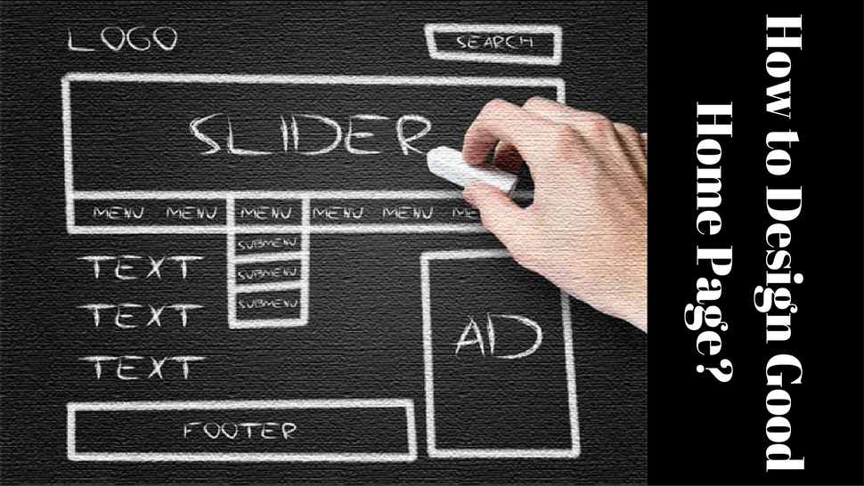
ELEMENTS OF THE GOOD HOME PAGE:
Under the elements of the website, we do not mean basic elements, such as header, content, sidebar, and footer. A good landing page must include the following elements:
1. GOOD TITLE
A good title on the cover page is not just something important for SEO and Google (H1), but it must attract the attention of the visitor and to clearly indicate where he is and who he is dealing with.
2. THE FORM FOR COLLECTION OF USER DATA
Although this part of the front page is not mandatory because this part of the space can be used in other ways, it would not be bad to offer visitors something in return. For example, through the data collection form, you can apply for some promotion you offer, or for periodic discounts. Of course, you must also indicate that you respect the privacy policy and you will not misuse the user information. Like everything on the site, this section must also be clear, concise and striking.

3. LIST OF ADVANTAGES
The next important element is the section, which outlines the benefits of the products you offer against the competition. This work should be left to the copywriter, while the web designer will decide in which part he should be located. This section does not necessarily have to be in the form of a list, but even one, but worthy, sentence.
4. BUTTON FOR ACTION (CTA)
The call to action is the point of sale, or purchase (depending on which side it is viewed). The button that calls for action (sales) must be visible in design, color, contrast, but, of course, it should not be too intrusive. Its position on the front page of the site must be such that the visitor (potential buyer) can spot it - not be searched by him immensely.
5. LIST OF CLIENTS
Even when there is a page with a portfolio in which you are publishing previous projects, it is very important to show the important clients with whom you worked in the past. Especially if they are big names and brands, the emphasis on good co-operation will leave a good impression on the visitor and can decide to move towards buying.

6. MARK OF QUALITY
Another great visual effect is quality marks - such as awards, nominations, elections, etc. It's good if you make them interactive and attract attention (just not aggressive, of course).
7. RECOMMENDATIONS
From the above, usually, the sections with the recommendations come out - look to highlight recommendations from important names and brands. Now is the moment to praise - and for a reason.
8. PRICES OR OFFER OF SERVICES
Customers like to clearly indicate which products you offer, and especially the price. Tell them without cause - it costs that much. Although in some cases this cannot be done (for details and numerous additional specifications) - display the service packages you offer.

9. ONE MORE BUTTON
As already mentioned, the button that calls for the action must be highlighted, and if you already have all these sections, it's important that you place another button at the bottom of the page. Users will not scroll up in search of the same - believe it, they are lazy - so help them and do not let them wander - add another button.
10. EXCELLENT PICTURE OF THE PRODUCT
Every SEO specialist will tell you that the content is never enough - but it needs to be used wisely. Since most people love good visuals, the site's page should have great images of your services or products. Even when it comes to new or already seen concepts - make sure that the photos are great.
11. ADDITIONAL TRUSTED CREDENTIALS
Trusted credentials serve exactly this - to indicate to the user that your business is checked and you will not deceive them. Examples of such tags are PayPal, MasterCard, Visa, Google Partner, etc.
Follow me on Twitter – @SrdjanKali.
Share the News